PoliSciPy
A Python Library for Political Data Analysis & U.S. Election Visualization
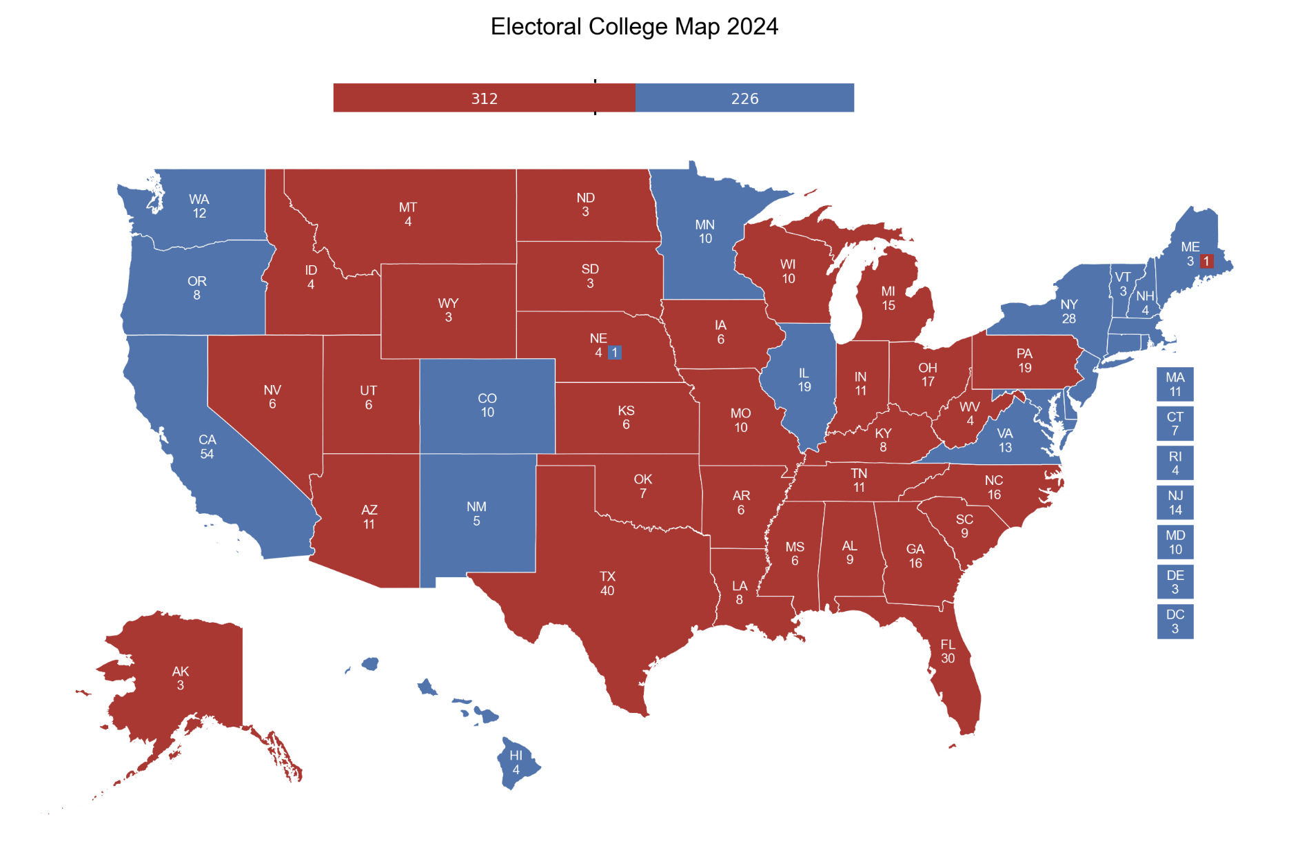
PoliSciPy is an open-source Python package that simplifies the creation of U.S. electoral college maps and political data analysis. What typically requires hundreds of lines of code with GeoPandas and matplotlib can be accomplished with a single function call.
| GitHub Repository | Documentation | PyPI | Conda |
Overview
Creating high-quality electoral maps in Python traditionally involves multiple complex steps: loading shapefiles, repositioning Alaska and Hawaii, adding state labels, applying custom colormaps, and formatting the visualization. PoliSciPy handles all of this automatically, allowing researchers and analysts to focus on their data rather than cartographic details.
Key Features
- Single-line map generation: Create complete electoral maps by passing a single data column
- Partisan colormap: Use custom color schemes for representing political leanings and competitiveness
- Visually appealing geography: Properly positioned Alaska and Hawaii with centered state labels
- Flexible analysis: Built for making highly customizable election maps for election data analysis and research
- Publication-ready output: Quickly create high-quality visualizations suitable for reports and presentations
How It Works
PoliSciPy improves upon existing political science data visualization workflows by incorporating custom-edited shapefiles, streamlined geometric transformations, and allowing a high degree of customization. The technical approach to the project involved three main steps:
-
Shapefile Preprocessing Using ArcGIS I edited U.S. Census Bureau shapefiles to move state polygons and add a
x_centroidandy_centroidcolumn to each state. This allows for state labels to be automatically positioned at the visual center of each state, eliminating the need for manual coordinate adjustments. -
Geometric Transformations Alaska and Hawaii are repositioned and scaled for better visibility on the continental map. The transformations are applied to each polygon’s coordinates using lambda functions to ensure the entire multipolygon shape is properly adjusted.
-
Custom Colormap Integration PoliSciPy includes a partisan colormap designed specifically for electoral data, making it easy to represent political leaning or competitiveness across states without manually defining color schemes.
With PoliSciPy
# Plot the electoral college map for the year 2024
plot_electoral_map(gdf, column='winning_party', title='2024 U.S. Electoral College Map')
Example Output

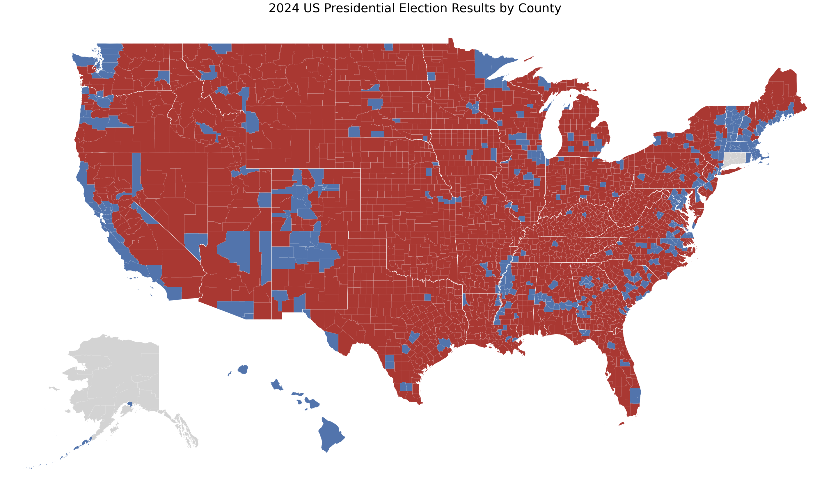
You can also create election maps at a county-level granularity:
